NIH Enterprise Architecture Website
Front End Design Style Guide
Brand and Visual Voice: Logo
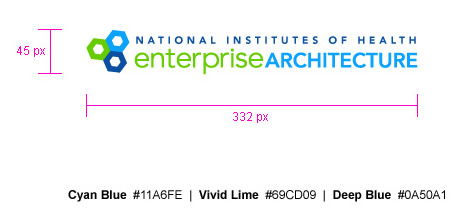
The Logo for NIH Enterprise Architecture is comprised of three parts - a primary name, a support name, and a mark.
The primary name is Enterprise Architecture. It is set with a combination of lowercase and all caps. This makes the two words appear shorter and easier to read. Vivid green is used throughout the site to signify content specific to user participation and collaboration. To reinforce this concept, Enterprise is green. Cyan Blue is used for all the technical content on the site and therefore the word Architecture appears in cyan.
The support name is National Institutes of Health and it always appears above the primary name. The NIH name adds legitamacy and purpose to the name Enterprise Architecture and therefore, the two names should never be separated.
Both names are set in Avenir, which was chosen for its clean, simple, geometric characters. It easy to read and communicates the utilitarian purpose of the site.
The mark represents both a molecular structure and nuts-and-bolts. It alludes to both science as well as the architectural concepts behind the organization. Additionly, the mark symbolizes the collaboration of multiple groups and how each becomes part of the whole.

Logo image files
- Link to EPS file to be added
- Link to JPG file to be added